
By Alastair Grant
In the Summer of 2009, Kabul, Afghanistan, a slide presentation was given to the US command. One of those slides has since bounced around the Internet as an
example of a military tool that has spun out of control. Like an insurgency, PowerPoint had reached the level of near obsession. Here is that slide:
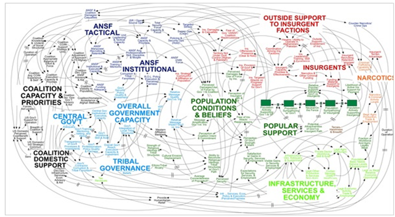
When we understand that slide, we’ll have won the war,” was General Stanley McChrystal’s reaction. The room erupted in laughter. We can all see why.
There have been other much more
negative reactions to PowerPoint: “PowerPoint makes us stupid,” said
Gen. James N. Mattis of the US Marine Corps, “It’s dangerous because it can create the illusion of understanding and the illusion of control,” General McMaster said this: “Some problems in the world are not bulletizable.” Commanders say that behind all the PowerPoint jokes are serious concerns that the software
stifles discussion, critical thinking and thoughtful decision-making.
So, the military has a problem with PowerPoint (PP) and in our experience it’s no different in commercial life: Bullet point slides can reduce complex detail to one-liners.
This is not another rant against PP which can be skilfully used to show graphs, pictures and diagrams in a way that would be hard to describe in words. Instead I think there are two quite separate issues: (a) The reduction of complexity into one liners, and (b) The multiple use of PowerPoint as both a memory prompt, a display to the audience and then later as a hand-out. In short,
a compromise.
Part One – Complex Situations
Nothing illustrates this better than the case of the PP presentations to NASA officials making life or death decisions during the final flight of the ill-fated
Columbia Space Shuttle. A report by
Edward Tufte in 2005 spelt out in detail his views on the effect of PP on the
decision making process. To remind you, in 2003, 83 seconds after lift-off, a piece of foam insulation broke off the shuttle and hit the left wing, breaking essential thermal insulation.
You might think 1.67 lbs of foam is hardly dangerous. But kinetic energy = 1/2mv2 which meant that the foam had the density of a large rock when the shuttle was accelerating to 600 mph.
Three reports were quickly prepared with a total of 28 PP slides. The detail level bullet points mentioned doubts and uncertainties but the high level
summaries with big bullet point
conclusions were quite optimistic: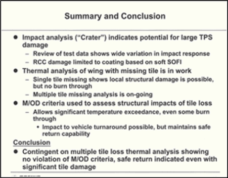
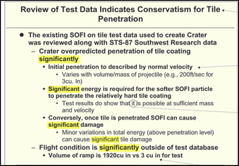
So it seems that some high level NASA officials decided that Columbia was safe. But other engineers hoped that the military would photograph the shuttle which might have spotted the damage to the wing. The slides below shows the word ‘significant’ and ‘significantly’ 5 times: The meanings of these two words, says Tufte, varies from “detectable in perhaps an irrelevant calibration study” …. to …“an amount of damage so that
everyone dies.”
So what does this mean for us? A simple point is that a complex subject needs to be spelt out with the skill of a journalist – this does not mean more words on a slide when presenting but to avoid bullet points which save the presenter the need to polish their thinking to put over an analytic, persuasive point. Imagine lawyers presenting arguments in court with slides instead of legal briefs. Imagine a priest in church or a politician making a case with bullet points. Try reducing Lincoln’s magnificent Gettysburg address with bullet points!
Part Two -The Compromise
This is a different matter altogether. I see PP being used three different ways:
First: The Prompt. Presenters prepare
presentations, often by putting their thoughts and structure into a series of word slides. The presenter likes the
comfort blanket of words slides to
remind them what to say rather than to be of high value to the audience.
Second: The Handout. The slides are also handed out so that there is a record of what is said – even for those who were unable to attend the presentation.
Third: High value slides. And of course some slides are shown as they provide detail and insight that cannot so well be described by the human voice. Graphs, charts, diagrams, and pictures have direct and beneficial impact on the audience.
This threefold use of PP is a compromise. How can this be more sharply focused? Here are 3 ideas:
(a) Presenters can cut back on detailed word slides and rows of bullet points by using their own notes. These could be on paper but if the slide is being projected then the dual screen use of PP allows the notes to be seen only by the presenter. (b) Handouts do not work well if they are a series of bullet point slides. Here there must be a description of what is going on. This links well with the points made above about the Challenger mishap.
(c) Insert some blank slides on screen. Here the audience has little choice but to listen to the only source of information. This allows a more complex thought process to be developed. At that stage a summary in bullet form makes sense.
Summary
It’s easy to poke fun at PP but not so easy to give helpful advice to those working under pressure to meet deadlines. But be clear that complex arguments may lose cohesion if all is reduced to pithy bullet points that give an illusion of logic and crisp efficiency. Be fully aware of the compromise dilemma.
The main purpose of a slide should surely be to add value to the audience by:
(a) Showing a point/argument/detail more clearly than the speaker can
describe, and (b) Making a point more memorable after the event.